Thursday, 5 March 2020

Advertising key conventions

Advertising key conventions

Image result for nike advert


1) What key conventions of an advert can you find and what are the connotations of each one?This picture shows that the shoes are will be sneaky and quite.

2) For each convention, write about how this appeals to a target audience. 
The picture will tell the audience that the product was made for people to be steal and don't like the sound of the shoe hitting the ground.

the logo is at the bottom so you know its Nike but its on the bottom so it wont stand out when looking at the picture.

the background is black with a iron man on the back which shows that its made similar to the iron man.

The slogan is the sneaker makes he man which suggests that the shoe is for man or child  who likes iron man. 

The colour scheme shows 

3) What is the USP (unique selling point) of the product and how do you know?the unique selling point is that the shoe from Nike comes from a big brand and the slogan shoes that if you dont have the shoe your not a man.


1) A clear brand identity
Image result for anthony joshua jd


3) An emotional connection to audience

Image result for water aid advert4) An innovative or ‘different’, subversive concept (e.g the porcupine advertising VW car)
Image result for animals and cars advert
5) A foreign advert that you can understand despite the language barrier

Image result for foreign advert

Tuesday, 3 March 2020

LR blog task

1) Type up your feedback in full (you don't need to write the mark and grade if you want to keep this confidential). WWW:some ability to identify magazine conventions and comment on how it could communicate meanings to an audience 
EBI: Revise all magazine conventions and why they are used :Revise social and cultural views on font covers of tatler e.g James Goren and his Ariosto friends suggests this magazine is aimed at upper middle class. 


Q1:2/2
Q2: 3/12 future revision:Cover lines, Large central image and san serif 
Q3:3/8 

4) Look specifically at question 2 - pick out three points from the mark scheme that you didn't include in your analysis of the unseen Grazia magazine cover.i didn't include enough media terminology and didn't include enough support for the answer. 


5) Now look at question 3. Use the mark scheme to identify three points you could have made regarding how Tatler reflects British social and cultural values.
1. The title organisation from the verb tattle which suggests gossip and different things.  
2.the cover line reference  millennial Sloane reinforces the young upper-middle class target audience that this magazine could potentially appeal to you .
3. the issue is more interested in the fashion, merchandise, beauty and lifestyle

Thursday, 13 February 2020

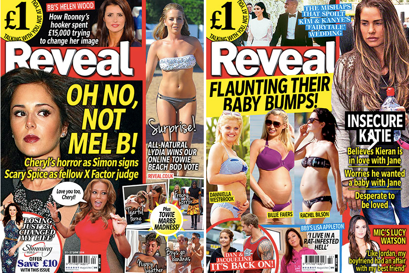
Reveal: case study blog task

Reveal: case study blog task

1) How many of the 12 magazine cover key conventions feature on this edition of Reveal? List them with specific reference to the convention on the CSP edition of Reveal.
paparazzi shots-natural images off celebrities make them fell not real 
central image-is the main article of the image 
price tag-show the cost before you buy it to use up the space
bar-code-to fill up the empty sapce so it makes the magazine more interesting to the consumer.
colour scheme- to show the different varieties of bright colours to get the consumer interested.

2) What is the font choice used on the cover and what does this choice connote?  this choice is picked to stand out to people and to show that they will be more interesting for the reader and the picture 

3) How do the cover lines appeal to the Reveal target audience?   The target audience get appealed by the cover lines because of the posh writing and the different type of font e.g sanserif or sans.

4) What are the connotations of the Reveal colour scheme on this particular front cover? the connotations are specifically made so that when the audience reads it with the colour scheme they will see the which will make them more popular.

5) How are images used to create interest in the magazine? Find three reasons for your answer. (E.g. mise-en-scene such as props, costume and make-up, body position, facial expression).they will use Photoshop which will change what the picture originally was also the lighting of the picture would also add audience because it would be eye catching and the setting would also show where it was set which would want the people to go there and it would get popular.

6) What differences can you find between the use of design and typography between Tatler and Reveal? List at least three and explain the effect on audiences. they are mostly about how to get fit which is especially made for women who don't like how they look they also for celebrities and what they are doing and in tatler it is mostly clothes which shows how they dress than how they look in Tatler which is an obvious difference between them, the last difference is the front cover, reveal has a hidden title with writing and pictures everywhere which shows how it creative one is and Tatler just has a background which is interesting with a big title in the open.


Representations

1) What type of celebrities appear on the front cover? How are they represented in Reveal? (Positive? Negative? Reinforcing or challenging stereotypes?)the male are represented as negative this is seen when pete looks like the one who is cheating but in reality they are both just talking its just that reveal wanted to make pete look like the bad on. but on a different picture we see that mark is a positive representation because it shows how they are a couple and they aren't doing anything bad.

2) How are women represented on the cover of Reveal? Think about both images and cover lines here. They are represented has they are rich and live life also 
3) How do Reveal and Tatler represent social class? (E.g. middle/upper class and working class)they represent social class as upper because of the amount of celebrities and the girlfriends that mark have which shows the different lifestyles.

4) What would be the preferred and oppositional readings to this cover of Reveal? The prefered reading would be what the famous people's lifestyles are and the oppositional would be that the celebrities are cheating and makes tension for people 


Social and cultural context                                                                             1) What aspects of British life are reflected in Reveal? How does this compare to Tatler?This is compared by tatler is just clothes and Reveal has more of useful information about whats going on with celebrities and the other entertaining things e.g where to go for summer or mother hints.

2) What do the cover lines in Reveal suggest about the issues and lifestyle of Reveal readers?the issue with there lifestyle are that they are not always true and they could be acting for a reason so it looks real but they just fake it so mostly they could be lying 

3) Find three other front covers for Reveal. What issues or features regularly appear in Reveal? the issue that regularly appear are the celebrities and always about spy paparazzi's that follow them and most of the time make up a serious thing.

Image result for Reveal magazineImage result for Reveal magazineImage result for Reveal magazine

Tuesday, 28 January 2020

Tatler- Blog task

Introduction 

1) Look at the Tatler Media Pack. Go to page 2: how does the editor introduce the magazine? They introduce the magazine by telling the consumer that there are popular models and has a lot of rich type words showing that its for rich people there for it shows that its for rich people

2) Now go to page 4 of the Media Pack. Focus on the print magazine (NOT tatler.com - the website). List the key demographic details: age, gender %, ABC1 % (social class), HHI (Household Income), % of those living in London and the South East. What do these demographic details suggest about the average Tatler reader? Age:41, Gender: female 73%, ABC 51%, HHI(house hold income)£261.572, people living in London and the south east is 70% this shows that the average of people on Tatler are mostly girls for the fashion and that there are mostly from London instead of higher up in Scotland. 

3) Look at page 6. What do Tatler readers think about fashion? How much do they spend?They spend £843M a year on fashion. Tatler readers think that there fashion is good and that most of the Tatler people actually buy there clothes that are very expensive.

4) Go to page 10. What are the special editions of Tatler that run throughout the year? What does this suggest about the pyschographic groups who read Tatler? there are different types for summer ,winter ,autumn ,wedding and different months which shows the fashion for each months and the most trending ones.  

Media language


1) What different examples of typography can you find on the cover of Tatler? What are the connotations of the serif and sans serif fonts? I can see serif and i can tell its serif because of the typography with the begging or end of the letter with a small line to show the type of typography.

2) How do the cover lines appeal to the Tatler target audience? the cover is appealed to the audience by the background and the clothes which rich people would want.

3) What are the connotations of the Tatler colour scheme on this particular front cover? the colours would represent what tatler is like clothes and the materials  .

4) How is the central image designed to create interest in the magazine? Find three reasons for your answer. (E.g. Mise-en-scene such as props, costume and make-up, body position, facial expression) The central image is made for interest with the zebra and the background 

Representations

1) What different groups of people are represented on the cover? (E.g. men/women/white people etc. Look at the image and text/cover lines to help here) .... there are mostly women and because mostly women would want to look at this has its for girls based fashion e.g clothes and the colour also the people there.

2) What do the cover lines suggest about the lifestyle of rich people in the UK? the cover line suggests that rich people's lifestyle is more in the open like where there are animals and lots of trees are this shows where all the rich people from England are more likely to live in a mansion.

3) Are there any stereotypes being reinforced or subverted? How? Why?there are some stereotypes we can see this on pg3 as there are only girls and this shows that there are only girls. 

4) What would be the preferred and oppositional readings to this cover of Tatler? the prefered reading is that they want women to go and buy there clothes for money and the oppositional meaning is that they just look at the background.

Social and cultural context


1) What aspects of British life or people are NOT reflected in Tatler? (Watch the clip above again if you need help with this - the clue is in the title 'Posh People')
The parts where some people can't afford certain things and are middle class not upper.In British life, not everybody is interested in posh and fancy things and more interested in gossip about a star celebrities 


2) Tatler runs special issues on holidays, spa breaks, cosmetic surgery, watches and jewellery and private schools. What does this suggest about the magazine's representation of life in Britain?
that there are many things to do. IT shows that in Britain  there is something to do and explore and see. 

3) What audience groups might be offended or insulted by the front cover of Tatler April 2017? those of lower class or and  middle working class.This is because it shows stuff of rich people and targets rich people as well. Those who are not interested in posh things or own nothing posh and then start to feel offended because it seems that they should have and been rich.

4) Find three other front covers for Tatler. What issues or problems are regularly featured in Tatler?
Image result for tatlerImage result for tatlerImage result for tatler

Thursday, 16 January 2020

Learner Response on test Blog task

Learner Response

WWW:- some knowledge on the film CSP's we have studied -Recalled a film marketing method

EBI:_ Revise media terminology and be able to apply to your analysis of media products. e.g Connotation,, verbal codes, reception theory and vertical integration.

Q1-0/1 i got it wrong because when he had the cigarette gun i thought i meant that smoking kills

Q2-0/1 I didn't really understand the question.

Q3-1/8 I didn't get the full mark because i didn't explain enough and i didn't write about the preferred or Opposition reading fully

Q4-0/2 I didn't understand the two benefits to media companies of vertical integration

Q5-1/2 i didn't get full mark because i couldn't really tell if news articles where one or not.

Q6-5/20 I couldn't get full mark because i don't feel like i wrote enough media technology  and i could of added more.

 I didn't get connotation, media code and reception theory.

Vertical integration: Vertical integration is when the a small company works for a bigger one so shows of the small one is owned by the bigger one.

The 4 Paragraph 20 Mark essay

I some what agree because i,Daniel Blake was a low budget movie but made so much profit it was a better movie and in total the better one. But Doctor Strange had way better equipment and a higher budget which means they had better quality of the stuff e.g set-up.

Doctor strange had more people watch it because of the company (marvel) which would of boosted the profit also they marketed the film e.g posters on busses, trailers on social media but i Daniel Blake had more profit but they didn't market the film has much as Doctor strange did so they had a bigger success than Doctor strange.

In conclusion, I would say that they couldn't cope against Hollywood blockbuster because they dont have lots of money and it didnt have enoguh people to watch it so it didnt blow up or anything also there budget was really low so there was bad equipment. Doctor strange was better in views because they were mad on blockbuster so it would be way way more popular. 

Kidulthood poster

KIDULTHOOD (poster)Blog task

 1) List the people, places and groups represented in the poster. E.g. men, women, teenagers etc.
the people are We can see the leader who is at the front and his friends at the front they are wearing hoodies and jeans which shows how they act also they are around 15 which shows they are really young.

3) What is the preferred reading of this poster?
 Teenagers are normal and they got caught in a fight with someone like a gang and they had also you wouldn't see a girl with gang fights which shows that gender doesn't matter in kidulthood

4) What is the op-positional reading of this poster? Teenagers are in a stage where they are rude and fights also act hard. 

Extension: What does this poster suggest about British society? 
That There are lots of gangs in England and it isn't safe mostly it is London where all the gangs are but some of them are outside which shows that 


The Times - Introduction: blog tasks

The Times - Introduction: blog tasks 1) What year was  The Times  founded and when did it start using the  Times  name? It was founded in th...